Dictionary Page Card
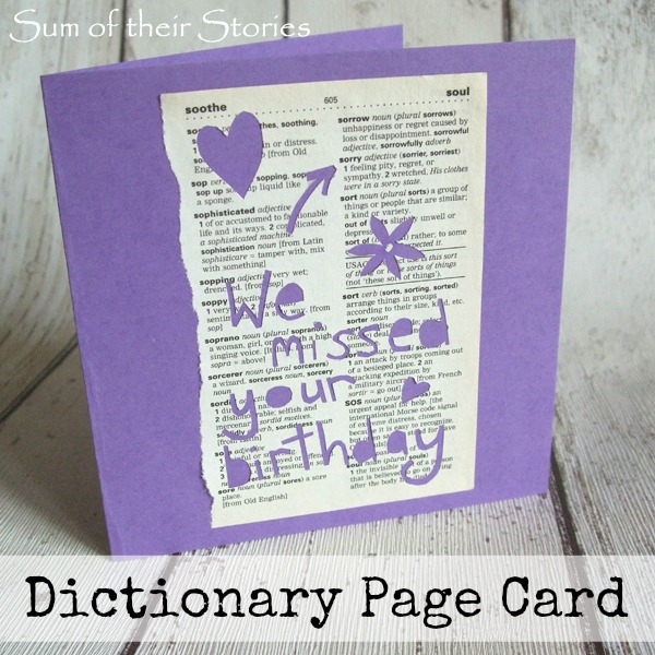
/I missed the birthday of a friend the other day so I wanted to make a card that was a little bit different to make it up to her.
At the same time my daughter was having a big clear out of her room and was throwing out her old school pocket dictionary. It was a bit damaged so not suitable for the charity shop but perfect for some papercrafting. I had seen this lovely Rob Ryan cut on pinterest and thought I could try a simple "inspired by" version.
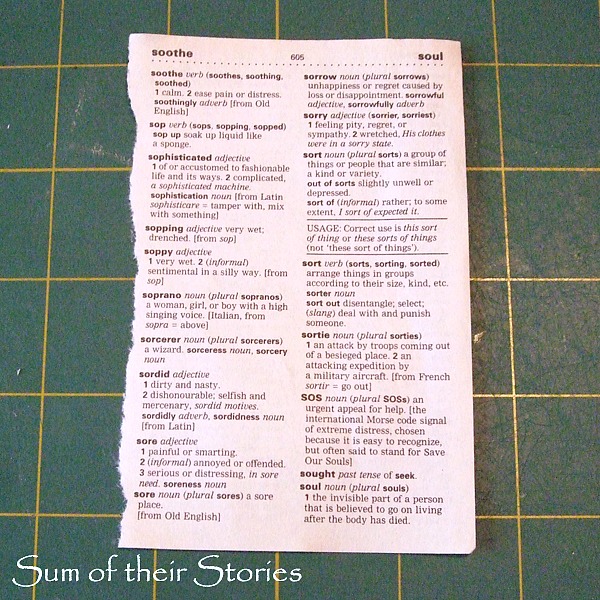
The dictionary is pretty small, the pages are just 4.5" x 3". They are not a great quality paper either which meant I needed to make the paper cutting really basic or risk it tearing.
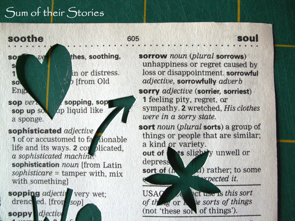
So I ripped a page out of the dictionary with "sorry" on it.
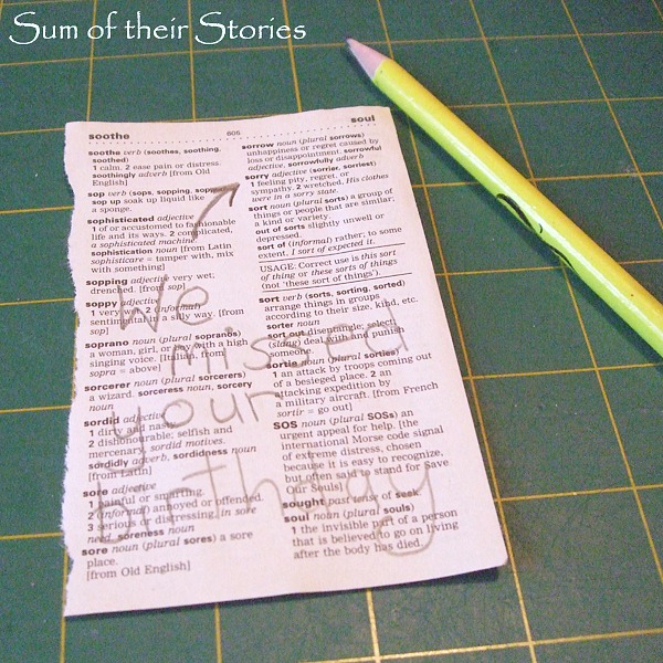
Then I wrote my message on it in pencil.
Then cut it out with my Xacto craft knife. Like I said, I had to be careful as the paper is not much better than newsprint but it was not complicated so only took a few minutes.
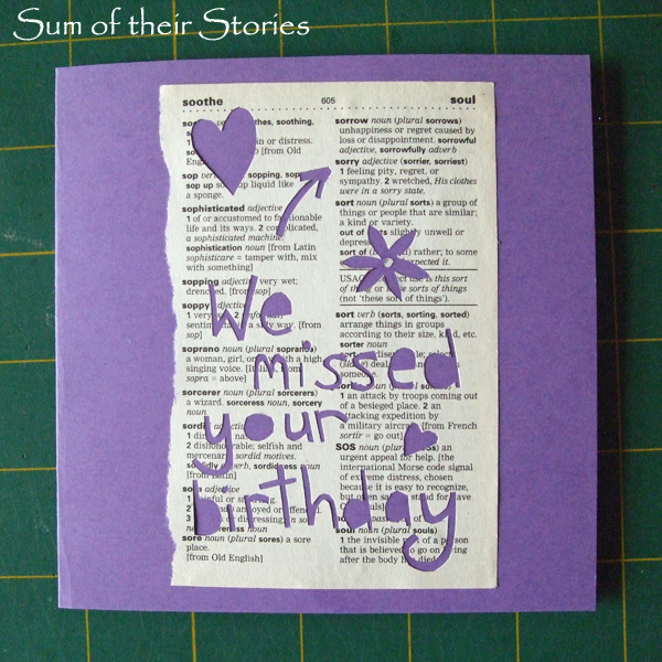
I added a few hearts and flowers too.
See how the arrow points to the "sorry".
Then I just stuck it to a 5" square card.
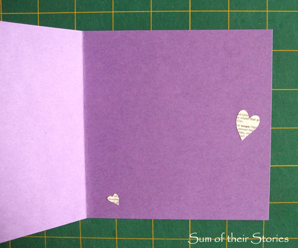
I finished it off by sticking the hearts I'd cut out on the inside.
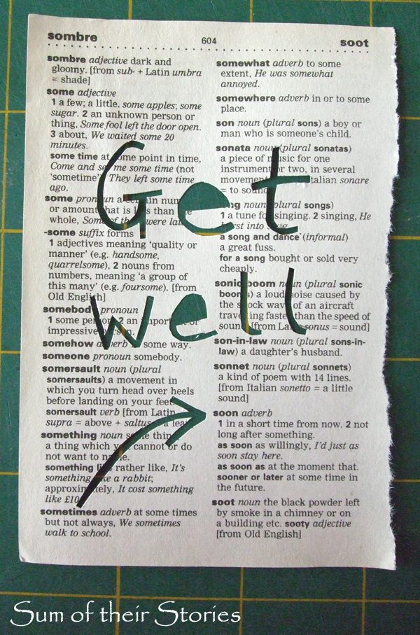
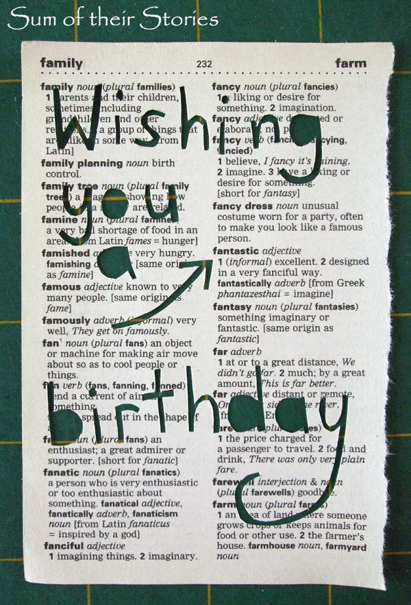
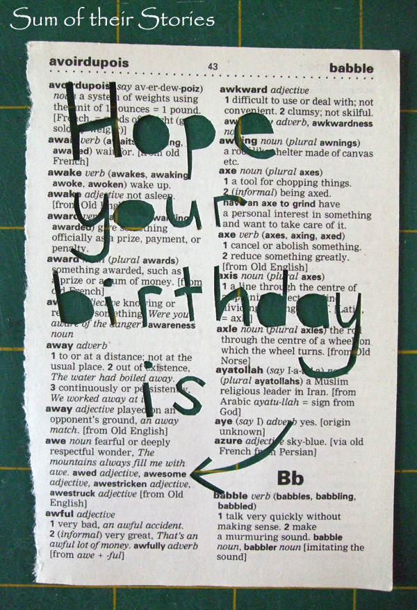
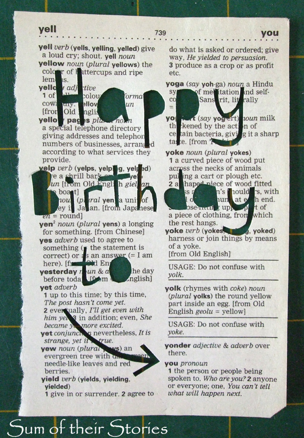
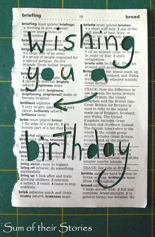
I like this idea so much I've done a few more pages to make into more cards.
Some words are in awkward places on the page so I've not been able to do all the greetings I had in mind but it is fun to try to think of a good way to write a message.
A bigger dictionary would give more scope for more similar projects, maybe even a picture, so I'll be keeping my eyes open at charity shops for a while. I've also found an old Thesaurus which I've been able to use to make a few more of these cards with.
I have a few of these cards listed in my Etsy Shop if you don't fancy making them yourself.
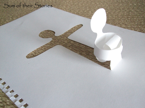
Whilst I was in a "papercut-y" mood I also had a little go at this cute little person that I had seen by Priyam from Simple Joys ages ago.
How cute is that? I don't know what to do with him now, he was just another "I made it just to see if I could" thing really! Priyam didn't give any instructions as he is pretty self explanatory, I did find I had to make his legs a lot longer than I thought I would so he could hug his knees. I also learnt the hard way that light pencil lines are a good idea because you can see the back of the paper when he sits up!
This shows how big my guy is. His hands are held together with just a tiny dob of glue. Thank you Priyam for the fun idea.
I'll be linking up this project at these lovely link parties
